About the project
Rombii is a leading B2B digital marketing agency catering to IT buyers. They approached us to design and develop their website the goal was to make a modern website with a professional and creative look. After a few meetings, we figured out Rombii’s vision and how to successfully deliver its message.
Style guide
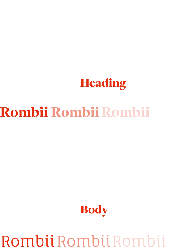
Starting with the project, we set up a universal style guide that accurately represented Rombii’s brand guidelines. For the type,we paired Freight Display with Fauna one, and mixing in different type led to a visually prominent contrast. The palette included sharp colors of red, white, and dark gray.
Typography
Colors

A home page that inspires action
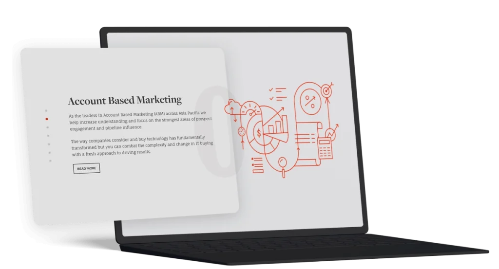
Our team designed the UX layout to make essential and relevant information stand out, accompanied by inviting call-to-actions. Different services were divided into distinct sections using clear lines and contrasting colors. We efficiently made use of typography and negative space to keep the design clean and modern. We also designed custom illustrations to fit in with the content and later animated them on scroll.

Gripping color shades & attractive imagery
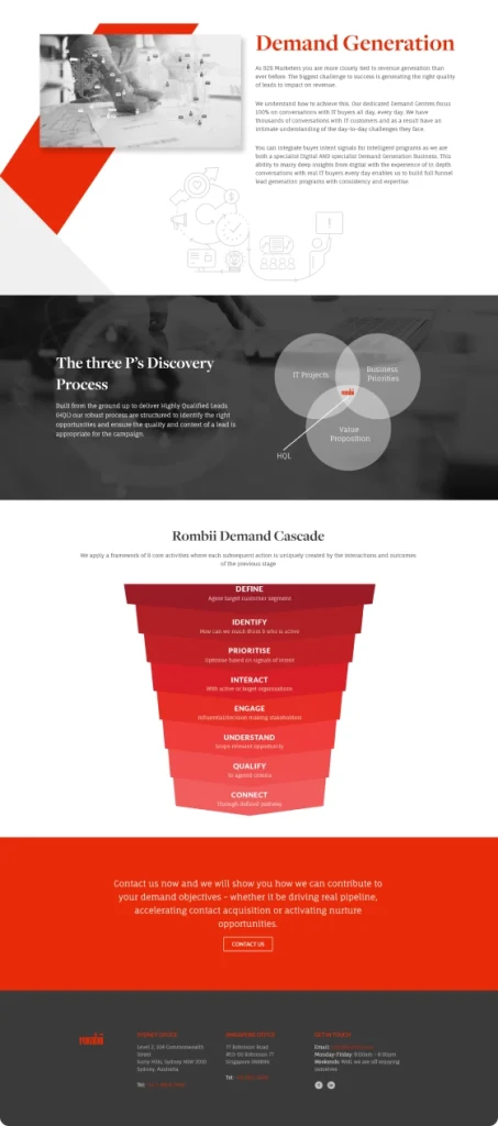
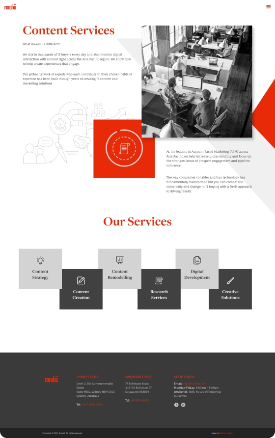
In the inner pages of Rombii, we used different shades from the color palette to enhance the visual appeal. We combined that with eye-catching illustrations and images that easily fit together.

A seamless experience throughout
The website’s entire content follows the same visual look and UX layout, leading to a brand identity customers can remember.
“Working with Pixelative is always a good experience. They try their best to find solutions for any issues that we encounter during the project. They are supportive and ask great questions to stay one-step ahead. I recommend Pixelative to anyone looking to build a website – they’re excellent with conceptualizing a site from briefing and definitely tick all the boxes for execution.”
Case studies


