Style guide
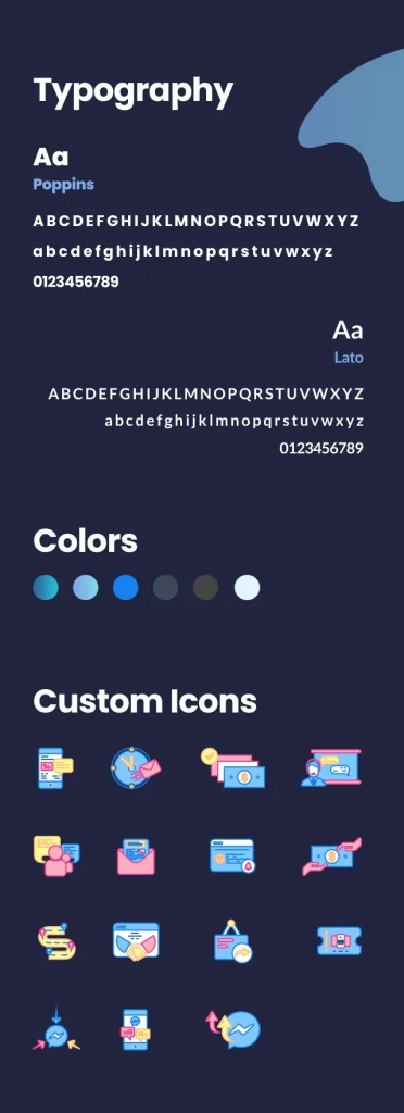
To match with their brand, we chose Poppins and Lato for the type and gradients of blue as the primary colors. We introduced contrasting tints and shades to the color palette to complement the primary colors. Our illustrator designed custom icons to be used throughout the website to convey their message easily.
Home page
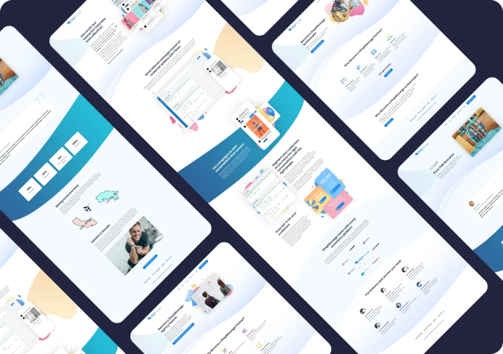
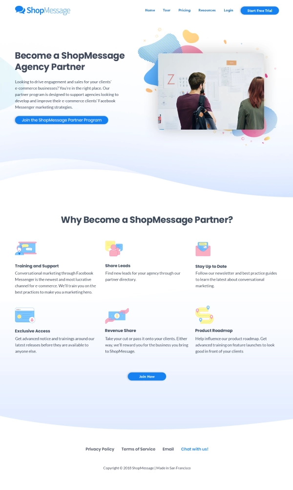
The website had to convert a visitor into a customer. Yet simultaneously, be very brief, concise, and have a clean, modern look. To approach this task, we used different colors and shapes to segregate sections. We illustrated abstract shapes like blobs and waves to make the design creative that would grab the visitor’s attention.

Other pages
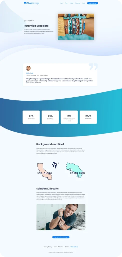
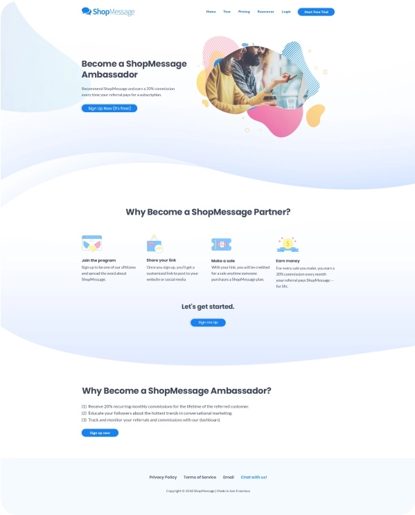
The main goal for the website was to increase the conversion rate. That is why we strategically placed several Call-to-Actions throughout the website. We designed creative illustrations throughout the website to keep the user experience enjoyable and easily convey the message to the target audience.
Responsive website
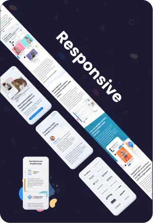
We developed the website to be responsive for all devices, designing mobile and desktop versions of all pages. Our team optimized the website for the viewports in between, i.e., tablets and laptops.
“High quality work with clear communication. They proactively provided suggestions to ensure the project was completed above expectations.”
Nick Edwards
CO-Founder
shopmessage
Case studies


